 Fact checked by
 Want to know how to build an interactive photo gallery using HTML? In this tutorial, I’ll walk you through this fun and practical HTML project step-by-step.
Whether you're just starting your HTML journey or looking to sharpen your skills, creating an animated business card is a fun project to learn real-world web development skills.
In this HTML tutorial, you'll:
- Structure your interactive photo gallery with semantic HTML to ensure your content is clear and accessible, making navigation easy for all users.
- Use CSS to style your gallery, focusing on layout, aesthetics, and interactivity to create a visually engaging and user-friendly experience.
- Apply responsive design principles to ensure your gallery looks great on any device, from large desktop screens to compact mobile phones.
- Implement modern web design techniques like Flexbox and CSS Grid to enhance the layout and functionality, allowing for dynamic content organization that adapts to various screen sizes.
- Add dynamic elements and interactions with JavaScript, such as image filtering and modal pop-ups, which will make your gallery interactive and appealing to visitors.
- Enhance your gallery with professional and personal touches, making it stand out as a showcase of your technical skills and artistic sense.
Through this tutorial, you'll not only develop a fully functional and interactive photo gallery but also gain valuable insights into the integration of HTML, CSS, and JavaScript for creating sophisticated web applications.
To make the most of this tutorial, having basic knowledge of HTML, CSS, and JavaScript is beneficial.
But you don't need to be a web development expert to follow along. I've designed this guide to be beginner-friendly, with clear explanations and practical examples.
I’ve also provided the full source code for this HTML project so you can follow along, experiment, and even build upon it for your own projects.
How To Create An Interactive Photo Gallery Using HTML
Ready to start your web development journey with a hands-on HTML project?
Today, we're going to build an interactive HTML photo gallery, which is perfect for those with a basic understanding of web design looking to expand their skills.
This project will demonstrate how to use HTML to structure your gallery effectively, CSS to enhance its visual appeal, and JavaScript to add interactivity.
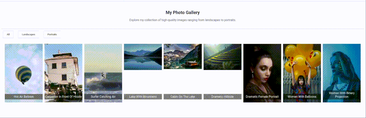
Check out the image below for a preview of what you’ll build!
Wondering if it's challenging? It’s manageable!
I’ve designed this HTML project to be beginner-friendly, dividing it into easy-to-follow steps.
Whether you're somewhat experienced in web development or looking to advance your skills in HTML, CSS, and JavaScript, this project is great for skill enhancement.
By the end, you’ll have a dynamic gallery for your portfolio and a deeper understanding of HTML, CSS, and JavaScript integration.
Project Prerequisites
Before starting, ensure you’re comfortable with basic HTML, CSS, and JavaScript syntax. I will cover everything else you need.
Plus, if you need to brush up on any of these areas, you can always check out a web development course.
I should also mention that it’s important to be willing to experiment and learn from mistakes. Maybe that sounds obvious, but trust me, this is one of the best ways to learn.
Plus, if you get stuck, you can even consider using an AI coding assistant like GitHub Copilot to help out, but I’d recommend waiting until you’re 100% stuck, as this is where you really learn.
Remember, we're also here to help, so don’t hesitate to search hackr.io for help as you go along.
Step 1: Setting Up The Project
Let's start by preparing your environment to develop an interactive photo gallery with HTML.
If you want to dive straight in, I'd recommend following along with me using our online coding environments.
We’ll use some JavaScript for this project, so I’d recommend our online JavaScript compiler.
This is pre-populated with the HTML, CSS, and JavaScript files you need to build this HTML project without switching on an IDE.
Alternatively, I've outlined the steps for you to create the necessary files and organize your workspace on your own computer.
Just follow these, and you'll have a solid foundation for your project.
i. Choose an IDE or Editor
Before you start, choose an IDE or editor tailored for web development. If you’ve read my article on the best web development IDEs, you’ll see I favor Visual Studio Code (VSCode).
This is excellent for HTML and CSS and a solid choice if you’d prefer to build on your own machine.
ii. Install Necessary Plugins
If you choose VSCode, consider installing VSCode extensions like "Live Server" to preview your HTML pages in real time and "Prettier" for code formatting.
These tools will make your development process smoother and more efficient.
iii. Create a New HTML Project
Once your editor is set up, it's time to create a new project:
- Open your editor and select the option to create a new project or folder.
- Name your project folder something descriptive, like "InteractivePhotoGallery."
- Inside this folder, create three files: index.html for your HTML content, styles.css for your CSS styles, and script.js for your JavaScript logic.
iv. Set Up a Basic HTML Structure
Open your index.html file and set up a basic HTML structure. Here’s a simple template to get you started:
<!DOCTYPE html>
<html lang="en">
<head>
  <meta charset="UTF-8">
  <meta name="viewport" content="width=device-width, initial-scale=1.0">
  <title>Interactive Photo Gallery</title>
  <link rel="stylesheet" href="styles.css">
  <script src="script.js" defer></script>
</head>
<body>
  <header>
  <!-- Header content like a title or a navigation bar -->
  </header>
  <main>
  <!-- Gallery content will go here -->
  </main>
  <footer>
  <!-- Footer content, perhaps some contact info or social links -->
  </footer>
</body>
</html>
Use this HTML Editor to build and test your code.
This is the basic structure every HTML project that uses JavaScript starts with.
We've got our DOCTYPE, HTML tag, head section (with meta tags, title, and links to our CSS and JavaScript files), and the body where our content will go.
This basic structure also introduces the JavaScript file linked with the defer attribute, ensuring it loads after the HTML content.
v. Prepare for CSS and JavaScript Development
Make sure your styles.css is linked correctly, and your script.js is set to load at the right time in your HTML file to start adding styles and functionality in the next steps.
vi. Verify Project Setup
To ensure everything is set up correctly, try opening your index.html with the Live Server plugin or directly in your browser.
You should see a blank page with the basic document structure ready to be filled with content.
And there you have it! You’ve successfully set up your environment to create an interactive photo gallery with HTML.
Let’s jump into Step 2, where we’ll create the HTML structure for your interactive photo gallery.
Step 2: Creating the HTML Structure
With your development environment ready, it’s time to construct the HTML skeleton of your interactive photo gallery.
i. Create the Header Section
The header will introduce your gallery. You might want to include a catchy title or a brief description:
<header>
  <h1>My Photo Gallery</h1>
  <p>Explore my collection of high-quality images ranging from landscapes to portraits.</p>
</header>

<section id="gallery">
  <div class="photo">
      <img src="path-to-image-1.jpg" alt="Description of image 1">
      <p class="caption">Caption for image 1</p>
  </div>
  <!-- Repeat for other images -->
</section>
This sets the tone and context for the visitors to your gallery.
ii. Set Up the Gallery Section
This main part will hold all your images in a grid or other layout:
<section id="gallery">
  <div class="photo">
      <img src="path-to-image-1.jpg" alt="Description of image 1">
      <p class="caption">Caption for image 1</p>
  </div>
  <!-- Repeat for other images -->
</section>
Replace "path-to-image-1.jpg" with the actual path to each image for the image tags. Ensure that each image has an appropriate alt text for accessibility.
iii. Include a Filter Section (Optional)
If your gallery is large, consider adding filters to help viewers sort images by categories:
<nav>
  <button class="filter" onclick="filterGallery('all')">All</button>
  <button class="filter" onclick="filterGallery('landscapes')">Landscapes</button>
  <button class="filter" onclick="filterGallery('portraits')">Portraits</button>
  <!-- Add more filters as needed -->
</nav>
These HTML buttons are set up to trigger JavaScript functions that will filter the gallery based on the category.
iv. Add a Modal for Image Viewing (Optional)
To enhance the interactivity, include a modal that opens when an image is clicked, allowing for a closer view:
<div id="myModal" class="modal">
<span class="close">×</span>
<img class="modal-content" id="img01">
<div id="caption"></div>
</div>This section will be controlled via JavaScript to display images dynamically when clicked.
Here’s a summary of what we've accomplished in this step:
- Structured the Page Content: Created distinct sections like the header and gallery, employing semantic HTML for better accessibility and SEO.
- Utilized Semantic HTML Tags: Used <header>, <section>, <nav>, and <div> tags to enhance the organization and meaning of your HTML structure.
- Embedded Multimedia and Links: Introduced images with descriptive alt texts and dynamic elements like filtering buttons that will later interact with JavaScript.
- Prepared the Document for Styling and Interactivity: By structuring your document effectively, you've laid the groundwork for the next steps involving CSS styling and JavaScript functionalities.
Let’s move on to Step 3 to style your interactive photo gallery.
Step 3: Styling with CSS
Now your HTML structure is set up, it’s time to add styles to bring your interactive photo gallery to life.
We'll focus on creating a responsive layout and designing aesthetic details like animations and hover effects.
i. Include a Google Font
First, choose a font from Google Fonts that complements the aesthetic of your gallery.
For example, we might use 'Roboto' for its clean and modern appearance. Add this HTML link to your HTML file within the <head> section:
<link href="https://fonts.googleapis.com/css2?family=Roboto:wght@400;700&display=swap" rel="stylesheet">This link imports the 'Roboto' font, with normal and bold weights.
ii. Style the Header
Begin by styling the header with various tweaks like text color, font, and others to make it stand out as the introduction to your gallery:
header {
  background-color: #f8f9fa;
  padding: 20px;
  text-align: center;
  border-bottom: 1px solid #ccc;
  font-family: 'Roboto', sans-serif;
}
header h1 {
  font-size: 24px;
  color: #333;
}
header p {
  font-size: 16px;
  color: #666;
}
This styling gives your header a clean, professional look.
iii. Style the Gallery Layout
Use CSS Grid or Flexbox to arrange your images in a tidy, responsive grid:
#gallery {
  display: grid;
  grid-template-columns: repeat(auto-fill, minmax(200px, 1fr));
  gap: 10px;
  padding: 20px;
  font-family: 'Roboto', sans-serif;
}
.photo {
  position: relative;
}
.photo img {
  width: 100%;
  height: auto;
  display: block;
}
.photo .caption {
  position: absolute;
  bottom: 0;
  background: rgba(0, 0, 0, 0.5);
  color: #fff;
  width: 100%;
  text-align: center;
  padding: 5px 0;
}
This grid layout ensures that the gallery is responsive and the images adjust to the screen size.
iv. Style the Filter Buttons
Make the filter buttons interactive and visually pleasing:
nav button {
  background-color: #fff;
  border: 1px solid #ddd;
  padding: 10px 20px;
  margin: 10px;
  cursor: pointer;
  transition: background-color 0.3s;
  font-family: 'Roboto', sans-serif;
}
nav button:hover {
  background-color: #eee;
}
The hover effect adds a dynamic element, encouraging users to interact with the filters.
v. Style the Modal for Image Viewing
Create styles for the modal that displays the full image:
.modal {
  display: none;
  position: fixed;
  z-index: 1000;
  left: 0;
  top: 0;
  width: 100%;
  height: 100%;
  overflow: auto;
  background-color: rgb(0,0,0,0.9);
  font-family: 'Roboto', sans-serif;
}
.modal-content {
  margin: auto;
  display: block;
  width: 80%;
  max-width: 700px;
}
.close {
  position: absolute;
  top: 15px;
  right: 35px;
  color: #f1f1f1;
  font-size: 40px;
  font-weight: bold;
  cursor: pointer;
}
.close:hover,
.close:focus {
  color: #bbb;
  text-decoration: none;
  cursor: pointer;
}
#caption {
  color: #ccc;
  font-size: 16px;
  padding: 15px 20px;
  text-align: center;
  width: 100%;
}
This styling will create a dark overlay when the modal is active, focusing attention on the clicked image.
vi. Ensure Responsiveness
Add media queries to ensure your gallery looks good on both desktops and mobile devices:
@media (max-width: 600px) {
  #gallery {
      grid-template-columns: repeat(auto-fill, minmax(150px, 1fr));
  }
}
This media query adjusts the size of the gallery cells on smaller screens below 600px.
Here’s a summary of what we've accomplished in this step:
- Enhanced Visual Design: We applied CSS to improve the aesthetics and user interaction of your gallery.
- Responsive Design Implementation: Using CSS Grid and media queries, the gallery adapts to different screen sizes ensuring a good user experience on any device.
- Interactive Elements: With styling for hover states and modal views, the gallery becomes more engaging.
With the CSS styling in place, your photo gallery not only looks more appealing but is also ready for the dynamic interactivity that JavaScript will provide in the next step.
Step 4: Adding Interactivity with JavaScript
With the HTML structure and CSS styling in place, it's time to breathe life into your photo gallery with JavaScript.
This step will involve writing scripts to handle image filtering, modal interactions, and other dynamic behaviors.
i. Implementing Image Filtering
Start by writing a JavaScript function to filter gallery items based on categories:
function filterGallery(category) {
  const photos = document.querySelectorAll('.photo');
  photos.forEach(photo => {
      const isVisible = category === 'all' || photo.classList.contains(category);
      photo.style.display = isVisible ? '' : 'none';
  });
}
This function takes a category and changes the display property of photos that do not belong to that category, effectively hiding them.
ii. Setting Up the Modal View
Write the JavaScript necessary to open a modal when an image is clicked, and populate it with the correct image and caption:
document.querySelectorAll('.photo img').forEach(img => {
  img.addEventListener('click', function() {
      const modal = document.getElementById('myModal');
      const modalImg = document.getElementById('img01');
      const captionText = document.getElementById('caption');
      modal.style.display = 'block';
      modalImg.src = this.src;
      captionText.innerHTML = this.nextElementSibling.innerHTML;
  });
});

// Get the element that closes the modal
const closeButton = document.querySelector('.close');
closeButton.onclick = function() {
  const modal = document.getElementById('myModal');
  modal.style.display = 'none';
}
This script sets up event listeners for all images in your gallery.
When an image is clicked, it displays the modal and updates the modal's content with the image and caption of the clicked item.
iii. Enhancing Usability with Keyboard Navigation
Add keyboard functionality to improve accessibility and user experience, allowing users to close the modal with the 'Escape' key:
document.addEventListener('keydown', function(event) {
  if (event.key === 'Escape') {
      const modal = document.getElementById('myModal');
      if (modal.style.display === 'block') {
          modal.style.display = 'none';
      }
  }
});
This listener checks for the 'Escape' key and closes the modal if it is open.
Here’s a summary of what we've accomplished in this step:
- Dynamic Filtering: We implemented functions to filter images based on categories, enhancing user interaction.
- Modal Functionality: Set up scripts to handle opening and closing of a modal for viewing images, along with displaying the correct image and caption.
- Keyboard Accessibility: Added keyboard navigation for closing the modal, improving accessibility.
With JavaScript added, your photo gallery is now fully interactive, allowing users to filter images, click to view images in detail, and interact smoothly with the gallery interface.
Step 5: Review and Debug
With the HTML structure, CSS styling, and JavaScript interactivity in place, it's time to thoroughly review your interactive photo gallery and prepare it for public viewing.
i. Testing Across Different Browsers and Devices
Start by testing your photo gallery across various browsers (like Chrome, Firefox, Safari, and Edge) and devices (desktops, tablets, and smartphones):
- Cross-browser Testing: Check for layout discrepancies, font rendering, and interactive features like modal pop-ups and image filtering.
- Responsive Testing: Ensure that the gallery displays correctly in different screen sizes and orientations. Pay attention to touch interactions on mobile devices.
ii. Debugging Common Issues
Address common issues that might arise during testing:
- Layout Breaks: Use developer tools in your browser to inspect and modify CSS in real-time to fix any unexpected layout issues.
- JavaScript Errors: Check the console for any JavaScript errors, and debug them by reviewing your `script.js` file. Make sure events are correctly attached and that elements are properly targeted.
- Performance Optimization: Optimize load times by compressing images and minifying CSS and JavaScript files. Consider using tools like TinyPNG for image compression and online minifiers for your CSS and JavaScript.
iii. Code Validation
Use HTML and CSS validators to ensure your code meets web standards and is free from syntax errors. The W3C Validator is a reliable tool for this purpose.
iv. Test Responsiveness
Adjust your browser window size to simulate different screen sizes or use your browser’s developer tools to test various device resolutions.
Make sure your layout adjusts and looks good on mobile, tablet, and desktop views. Adjust your CSS using media queries if necessary to improve responsiveness.
v. Improve Accessibility
Ensure your page is accessible to all users, including those with disabilities:
- Check color contrast ratios.
- Ensure that all interactive elements are keyboard accessible.
- Use semantic HTML to aid screen readers.
- Include alt text for images.
vi. Optimize Loading Times
Optimize your page for faster loading times:
- Compress any images used without losing quality.
- Minify your CSS file to reduce its size.
- Check that your hosting solution loads your page quickly enough.
vii. Gather Feedback
Sometimes, it helps to get a fresh set of eyes on your project:
- Ask friends or colleagues to review your page.
- Gather feedback on the design, content, and functionality.
- Make adjustments based on the feedback to enhance user experience.
With your page polished and debugged, it's ready for the world to see.
The next step would be to consider how and where to publish it, so let’s take a look at that!
Step 6: Publishing Your Page
Now that your interactive photo gallery is fully developed, tested, and ready, it's time to publish it and look into ways you can continue to expand your skills.
This final step will guide you through the process of publishing your page online.
i. Choose a Hosting Service
To make your photo gallery page accessible on the internet, you need to host it on a web server.
Here are a few popular, user-friendly options that offer free plans:
- GitHub Pages: Ideal for hosting simple, static websites. Plus, it integrates directly with your GitHub repository, making updates easy.
- Netlify: Offers a straightforward drag-and-drop interface for deploying your site and automatic HTTPS.
- Vercel: Similar to Netlify, it provides easy deployment options and is great for static sites.
ii. Prepare Your Files for Deployment
Before uploading your files, ensure everything is named correctly and organized:
- Your main HTML file should be named index.html.
- Ensure all links to JavaScript, CSS, and images are relative and correctly referenced so they work on the web server.
iii. Upload Your Files
Depending on your chosen hosting service, the process will vary:
- GitHub Pages: Push your project to a GitHub repository, then enable GitHub Pages in the repository settings.
- Netlify/Vercel: Drag and drop your project folder onto their web interface or connect your GitHub account for continuous deployment.
iv. Set Up a Custom Domain (Optional)
If you have a custom domain, you can link it to your hosting provider to give your gallery a more professional look:
v. Test Your Live Site
Once your photo gallery is online, visit the URL provided by your hosting platform. Check everything once more to ensure:
- The page loads correctly.
- All animations and links work as expected.
- The site is responsive across different devices and browsers.
vi. Share Your Photo Gallery
Now that your photo gallery is live, share the URL on your professional networks, email signatures, and social media profiles.
Congratulations! You've successfully created and published your HTML interactive photo gallery.
This not only enhances your online presence but also demonstrates your ability to apply HTML, CSS, and JavaScript skills in a practical project.
Next Steps & Further Learning
Congratulations on successfully building and publishing your own interactive photo gallery!
While you've reached a significant milestone, there's still plenty to explore in web development.
First up, I’d highly encourage you to play around with the code I have provided, especially the styling.
There is so much more you can do here, and it’s an excellent way to express your personality.
Beyond that, here are a few ideas to keep enhancing your skills:
Expand Your HTML, CSS, and JavaScript Knowledge
- Advanced Features: Consider enhancing your gallery with additional features such as a search function, tags for images, or even integration with a database to handle a larger number of images dynamically.
- Learn a Framework: To further improve your web development skills, consider learning a JavaScript framework or library such as React, Vue, or Angular. These tools can help you build more complex and scalable applications.
Explore Additional Web Technologies
- Explore Backend Development: Understanding server-side programming can greatly enhance your capability to build comprehensive web applications. Languages like Node.js for JavaScript, or Python with frameworks like Django or Flask, are excellent starting points.
- SEO Basics: Learn the fundamentals of Search Engine Optimization to increase the visibility of your web page.
Engage with the Community
- Feedback: Share your photo gallery with peers to get feedback and suggestions for improvement.
- Open Source: Consider contributing to open-source projects where HTML, CSS, and JavaScript skills are needed. This can provide real-world experience and community engagement.
Keep Learning and Sharing
- Document Your Journey: Blog about the process of building your interactive photo gallery, what you learned, the challenges you faced, and how you solved them.
- Stay Updated: Follow web development blogs, join webinars, and participate in online communities to keep up with the latest trends and best practices.
And if you're hungry for more HTML projects, check out the rest of our step-by-step tutorials, including how to create an animated business card.
Interactive Photo Gallery: Full Source Code Example
HTML Source Code:
<!DOCTYPE html>
<html lang="en">
<head>
<meta charset="UTF-8">
<meta name="viewport" content="width=device-width, initial-scale=1.0">
<title>Interactive Photo Gallery</title>
<link rel="stylesheet" href="styles.css">
<link href="https://fonts.googleapis.com/css2?family=Roboto:wght@400;700&display=swap" rel="stylesheet">
<script src="script.js" defer></script>
</head>
<body>
<header>
<h1>My Photo Gallery</h1>
<p>Explore my collection of high-quality images ranging from landscapes to portraits.</p>
</header>
<nav>
<button class="filter" onclick="filterGallery('all')">All</button>
<button class="filter" onclick="filterGallery('landscapes')">Landscapes</button>
<button class="filter" onclick="filterGallery('portraits')">Portraits</button>
<!-- Add more filters as needed -->
</nav>
<section id="gallery">
<div class="photo">
<img src="other_1.jpg" alt="Hot Air Balloon">
<p class="caption">Hot Air Balloon</p>
</div>
<div class="photo">
<img src="other_2.jpg" alt="Carpenter In Front Of House">
<p class="caption">Carpenter In Front Of House</p>
</div>
<div class="photo">
<img src="other_3.jpg" alt="Surfer Catching Air">
<p class="caption">Surfer Catching Air</p>
</div>
<div class="photo landscapes">
<img src="landscape_1.jpg" alt="Lake With Mountains">
<p class="caption">Lake With Mountains</p>
</div>
<div class="photo landscapes">
<img src="landscape_2.jpg" alt="Cabin On The Lake">
<p class="caption">Cabin On The Lake</p>
</div>
<div class="photo landscapes">
<img src="landscape_3.jpg" alt="Dramatic Hillside">
<p class="caption">Dramatic Hillside</p>
</div>
<div class="photo portraits">
<img src="portrait_1.jpg" alt="Dramatic Female Portrait">
<p class="caption">Dramatic Female Portrait</p>
</div>
<div class="photo portraits">
<img src="portrait_2.jpg" alt="Woman With Balloons">
<p class="caption">Woman With Balloons</p>
</div>
<div class="photo portraits">
<img src="portrait_3.jpg" alt="Woman With Binary Projection">
<p class="caption">Woman With Binary Projection</p>
</div>
</section>
<div id="myModal" class="modal">
<span class="close">×</span>
<img class="modal-content" id="img01">
<div id="caption"></div>
</div>
</body>
</html>CSS Source Code:
header {
  background-color: #f8f9fa;
  padding: 20px;
  text-align: center;
  border-bottom: 1px solid #ccc;
  font-family: 'Roboto', sans-serif;
}
header h1 {
  font-size: 24px;
  color: #333;
}
header p {
  font-size: 16px;
  color: #666;
}

#gallery {
  display: grid;
  grid-template-columns: repeat(auto-fill, minmax(200px, 1fr));
  gap: 10px;
  padding: 20px;
  font-family: 'Roboto', sans-serif;
}
.photo {
  position: relative;
}
.photo img {
  width: 100%;
  height: auto;
  display: block;
}
.photo .caption {
  position: absolute;
  bottom: 0;
  background: rgba(0, 0, 0, 0.5);
  color: #fff;
  width: 100%;
  text-align: center;
  padding: 5px 0;
}

nav button {
  background-color: #fff;
  border: 1px solid #ddd;
  padding: 10px 20px;
  margin: 10px;
  cursor: pointer;
  transition: background-color 0.3s;
  font-family: 'Roboto', sans-serif;
}
nav button:hover {
  background-color: #eee;
}

.modal {
  display: none;
  position: fixed;
  z-index: 1000;
  left: 0;
  top: 0;
  width: 100%;
  height: 100%;
  overflow: auto;
  background-color: rgb(0,0,0,0.9);
  font-family: 'Roboto', sans-serif;
}
.modal-content {
  margin: auto;
  display: block;
  width: 80%;
  max-width: 700px;
}
.close {
  position: absolute;
  top: 15px;
  right: 35px;
  color: #f1f1f1;
  font-size: 40px;
  font-weight: bold;
  cursor: pointer;
}
.close:hover,
.close:focus {
  color: #bbb;
  text-decoration: none;
  cursor: pointer;
}
#caption {
  color: #ccc;
  font-size: 16px;
  padding: 15px 20px;
  text-align: center;
  width: 100%;
}

@media (max-width: 600px) {
  #gallery {
      grid-template-columns: repeat(auto-fill, minmax(150px, 1fr));
  }
}
JavaScript Source Code:
function filterGallery(category) {
  const photos = document.querySelectorAll('.photo');
  photos.forEach(photo => {
      const isVisible = category === 'all' || photo.classList.contains(category);
      photo.style.display = isVisible ? '' : 'none';
  });
}

document.querySelectorAll('.photo img').forEach(img => {
  img.addEventListener('click', function() {
      const modal = document.getElementById('myModal');
      const modalImg = document.getElementById('img01');
      const captionText = document.getElementById('caption');
      modal.style.display = 'block';
      modalImg.src = this.src;
      captionText.innerHTML = this.nextElementSibling.innerHTML;
  });
});

const closeButton = document.querySelector('.close');
closeButton.onclick = function() {
  const modal = document.getElementById('myModal');
  modal.style.display = 'none';
}

document.addEventListener('keydown', function(event) {
  if (event.key === 'Escape') {
      const modal = document.getElementById('myModal');
      if (modal.style.display === 'block') {
          modal.style.display = 'none';
      }
  }
});
Wrapping Up
Building an interactive photo gallery using HTML is a great way to level up your web development skills and delve into creating visually appealing and functional websites.
By creating this interactive photo gallery, you've tackled a variety of challenges, including crafting a visually engaging layout, handling styling with CSS, and ensuring your content is responsive and accessible across different devices.
In this tutorial, you’ve learned how to:
- Structure your content with HTML to create a clear, logical, and accessible web gallery.
- Use CSS to enhance the visual appeal of your gallery, applying styles that bring your images to life and make the interface user-friendly.
- Implement responsive design techniques to ensure your gallery looks great on both desktops and mobile devices, adapting seamlessly to various screen sizes.
- Utilize advanced CSS features like Flexbox and Grid for sophisticated layout designs that are both flexible and maintainable.
- Incorporate JavaScript for dynamic interactivity, allowing users to interact with your gallery through filtering options and modal views, enhancing the overall user experience.
- Prioritize web accessibility, making your gallery usable for everyone, including those with disabilities.
You now possess the foundational tools and knowledge needed to further develop and refine your interactive photo gallery.
Potential enhancements could include adding more complex animations, integrating with APIs to pull images dynamically, or expanding the gallery with additional interactive features such as user-contributed content or comments.
Your journey into web development doesn't end here. With these new skills, you're well-equipped to tackle more complex projects, explore different aspects of web design and development, and continue building a diverse range of engaging web experiences.
Have fun and happy coding!